Back to Portfolio
UX Case Study · FinTech · Smart Home

Pay for what you use.
Not what they waste.

Because your flatmate's Tesla shouldn't cost you $50 a month.

SplitGrid is a bill-splitting app for flatmates that charges each person based on their actual energy usage — not a flat equal split. I designed the full experience from onboarding to settlement.

UX Designer
iOS Mobile App
Figma
Product Design Project
UX Design Interaction Design Onboarding Data Visualization FinTech IoT / Smart Home

01 · Overview

Equal splits aren't fair splits.

Fair
billing based on actual usage, not equal splits
Real-time
device tracking per room and per person
One-tap
bill settlement with built-in payment transfer
Smart
QR-based device onboarding via Matter protocol

"The core design challenge wasn't the data — it was making complex energy tracking feel simple, transparent, and fair to people who just want to pay their bills and move on."
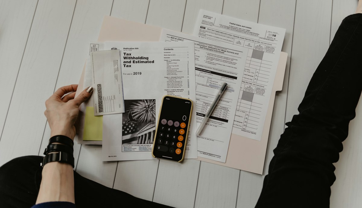
Energy bill and calculator on table

The monthly ritual nobody enjoys — splitting a bill that feels unfair.

02 · The Problem

Three real problems flatmates face every month.

Unfair equal splits

When bills are split equally regardless of usage, heavy users are subsidised by light users. This creates resentment and conflict in shared living spaces.

📊

No visibility into usage

Flatmates have no way of knowing how much energy each person or device is actually consuming — making fair conversations impossible.

💸

Painful bill settlement

Chasing flatmates for money, remembering who owes what, and managing multiple transfers every month is time-consuming and awkward.


03 · Research & Insights

The problem was emotional, not just financial.

😤

Resentment builds silently

Flatmates rarely confront each other about unfair usage. Instead, frustration accumulates over months.

🔍

Visibility changes behaviour

When people can see exactly how much their devices cost in real time, they naturally reduce unnecessary usage.

🤝

Trust requires proof

Flatmates won't accept a new billing system unless they can verify the numbers themselves.

📱

Setup friction kills adoption

For SplitGrid to work, adding a device had to feel as easy as scanning a QR code — because it does.

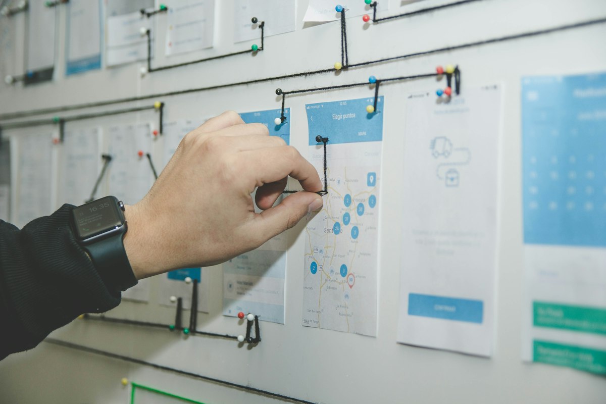
Research affinity mapping on whiteboard with sticky notes

Synthesising research findings — patterns that shaped every design decision.

"Fair billing only works if every flatmate trusts the system. That meant designing for transparency at every step — not just accuracy."

Design implication: show the maths

Every screen that involves money needs to show how the number was calculated. This led to the per-device watt/cost breakdowns in the All Devices screen and the room-by-room distribution on the dashboard.

All Devices Sam 1650W / $70 4 Sockets 17W / $8 Windows PC 300W / $12 Mercedes EQS 1000W / $50

watt/cost per device

Design implication: make ownership visual

The radial device map came directly from the insight that ownership needs to feel personal. A list of device names doesn't create a sense of "these are my devices and this is my footprint" — a spatial, person-centred view does.

me 🛴 🎸 🏎 🖥 🎮

radial ownership map

Design implication: reduce setup to seconds

Supporting Matter protocol QR onboarding was a direct response to the finding that setup friction kills adoption. If connecting a device takes more than 30 seconds, users give up.

scan to add matter protocol QR scan

QR device onboarding


04 · Design Process

Every screen had a job to do.

UX wireframes and sketches on paper

From rough sketches to hi-fi screens — each iteration was driven by user needs.

1

Onboarding — setting expectations before asking for anything

2

Device setup — two paths for different users

3

Import Contacts — social proof at the right moment

4

Dashboard — the most complex screen, simplified

5

Your Devices — a radial map for ownership clarity

6

All Devices — transparency across flatmates

7

Settle your bills — closing the loop

The full user journey — from splash to settlement.
11 screens covering onboarding, device setup, dashboard, usage tracking, and bill settlement.
Splash
9:41▲▲
SplitGrid
Get Started →
Onboarding 1
9:41▲▲
💰
Split Energy Bills
Pay for what you use
Next
Onboarding 2
9:41▲▲
🦸‍♀️
You are the boss
Control your Appliances
Next
Import Contacts
9:41▲▲
Import Contacts
These people use SplitGrid and have invited you
Sam
+1 495939493
Ryan
+1 5838574383
Sean
+1 4839756483
Load more 52 contacts
Allow Contacts
Setup
9:41▲▲
Setup
Search your Building
Apartment Number
Search
Or
Add your devices manually
QR Scan
9:41▲▲
matter QR code
Dashboard
9:41▲▲
Good Evening
Samuel
Energy Score
4
Energy Distribution
30% Bed1 35% Living 20% Kitchen 15% Bed2
Add Person
Shared Expenses
$12
📶
$30
Payment Record
Your Devices
9:41▲▲
Your Devices
🛴
🎸
🖥
🏎
🎮
Check Other Users
All Devices
9:41▲▲
All Devices
Sam
1650W / $70
4 Sockets17W / $8
Windows PC300W / $12
Mercedes EQS1000W / $50
Ryan
7 devices
Check Live Bill
Settle Bills
9:41▲▲
Settle your bills
Breakdown
$280
Me
Sean
Ryan
Sam
Transactions
Ryan has paid
Today 08:23 PM
-$326
Sean has paid
Today 10:43 PM
-$116
scroll to see all screens
05 · Key Design Decisions

The choices that defined the experience.

Radial device map

Instead of a flat list, devices orbit the user's profile in a radar-style layout. This makes energy ownership feel personal and spatial — immediately answering "which devices are mine?"

QR onboarding via Matter

Supporting the Matter smart home protocol means users can scan a QR code to instantly add any compatible device. This reduces setup friction to seconds rather than minutes.

Energy score on dashboard

A single "Energy Score" number on the home screen gives users an immediate sense of their usage without needing to read charts — designed for the 3-second glance.

Colour-coded usage indicators

Green, yellow, and red dots on each device in the All Devices screen let users instantly identify high-consumption appliances without reading any numbers.


06 · Reflection

What this project taught me about designing for fairness.

Transparency = trust

Every design decision around data visibility was motivated by the same goal: if a flatmate questions a bill, the answer should be one tap away.

Complexity needs progressive disclosure

The app handles complex IoT data. The design challenge was revealing that complexity only when users needed it — keeping the daily experience simple.

Social UX is different

This isn't just a utility app — it mediates relationships between people. Every screen that shows another person's data required careful thought about privacy and framing.

What I'd explore next

Notification design for payment reminders, dispute resolution flows, and an AI-driven suggestion engine for reducing energy costs.